Sponsored article
What Colors are Most Important in Cope Design?
- What is the Significance of Color in the Context of the Tradition and Form of Liturgical Copes?
- How Does Color Selection Affect the Perception of the Liturgy and the Importance of the Celebration?
- What Role Does Color Consistency Play in Designing Liturgical Copes?
- The Importance of Colors in Liturgical Cope Design – Summary of Key Principles
In liturgy, color is never accidental. It is a language of signs that operates before the celebrant speaks the first word and before the faithful join in the rhythm of prayer. In the case of liturgical copes, color becomes one of the most important carriers of meaning—organizing the celebration, emphasizing its importance, and leading the community into a specific dimension of spiritual experience. A well-designed cope not only visually complements the liturgy but also enhances the theological and symbolic message of the rite, making it clear, cohesive, and in line with Church tradition.
What is the Significance of Color in the Context of the Tradition and Form of Liturgical Copes?
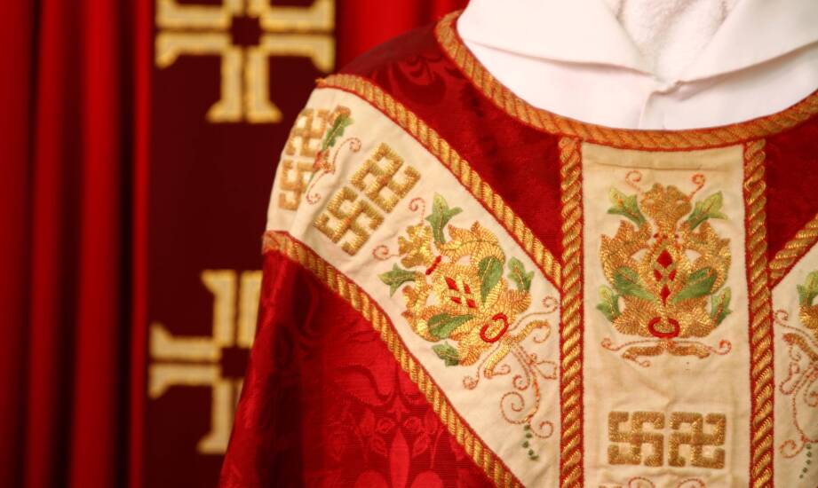
Color in designing liturgical copes fulfills theological, symbolic, and communicative functions, and its selection is not a matter of aesthetic choice but arises from the Church's long tradition and liturgical norms. The color of the cope dictates the nature of the celebration, time of the liturgical year, and the magnitude of the rite while organizing the visual message of the liturgy. In practice, this means that the cope's design must align with the existing symbolism of colors, regardless of whether it is paired with chasubles, dalmatics, or other vestments such as conical chasubles, which also adhere to the same color guidelines. White highlights joyful celebrations and the mystery of glory; red expresses sacrifice, love, and the Holy Spirit; green symbolizes spiritual growth; and purple accentuates times of reflection and preparation. In designing copes, it is crucial that the message is clear to the community of faithful, consistent with the liturgical calendar, and harmoniously integrates color with form and decoration.
How Does Color Selection Affect the Perception of the Liturgy and the Importance of the Celebration?
Colors of liturgical copes organize the liturgical experience, providing it with a clear semantic and emotional structure without the need for words. Each color acts on the level of symbol and perception, enhancing the celebration's meaning and highlighting its character. Green stabilizes and introduces the rhythm of the Church's daily life, purple builds an atmosphere of silence and reflection, and red intensifies the experience of the mystery of the Passion or the sending of the Holy Spirit. In design practice, this involves the precise selection of fabrics, color saturation, and their relationship with embroidery and decorations, which is especially important for offerings from entities like Ars Sacra, where the color scheme of copes must simultaneously meet liturgical, aesthetic, and functional requirements. The high quality of dyes and the durability of colors ensure that the garment maintains its symbolic message through years of intensive use.
What Role Does Color Consistency Play in Designing Liturgical Copes?
Consistency in the use of colors in liturgical copes ensures cohesion in the celebration and readability of liturgical signs, which are an integral part of the rite. Designing copes requires consideration of when a specific color is used, in what liturgical context, and how it relates to other vestments and altar elements. Gold is often used as a substitute color in the most solemn celebrations, highlighting their exceptional character, while rose appears sporadically as an expression of joy during penance. Each of these colors serves a specific function and must be used with moderation and awareness of its symbolism. As a result, a well-designed liturgical cope becomes a carrier of theological content, supports the concentration of the faithful, and enhances the rite's importance, maintaining full alignment with tradition and current liturgical norms.
The Importance of Colors in Liturgical Cope Design – Summary of Key Principles
Designing liturgical copes is based on a clearly defined color symbolism rooted in Church tradition and subordinated to the liturgical calendar. Firstly, the color of the cope organizes the time and character of the celebration, indicating joy, penance, passion, hope, or the solemn dimension of the mystery. Subsequently, color contributes to the visual coherence of the liturgy, remaining in relationship with other vestments and the presbytery décor. At a further stage, it determines the readability of the theological message, acting on the level of symbol and emotion before any word is spoken.
You might be interested

How to Properly Choose a Coffee Packaging Machine for Production Specifics?

What Benefits Does Deburring Automation Bring to the Industry?
How does modern mat design affect the perception of Commercial Spaces?